
Does Vinyl Flooring Look Cheap? What Makes the Difference
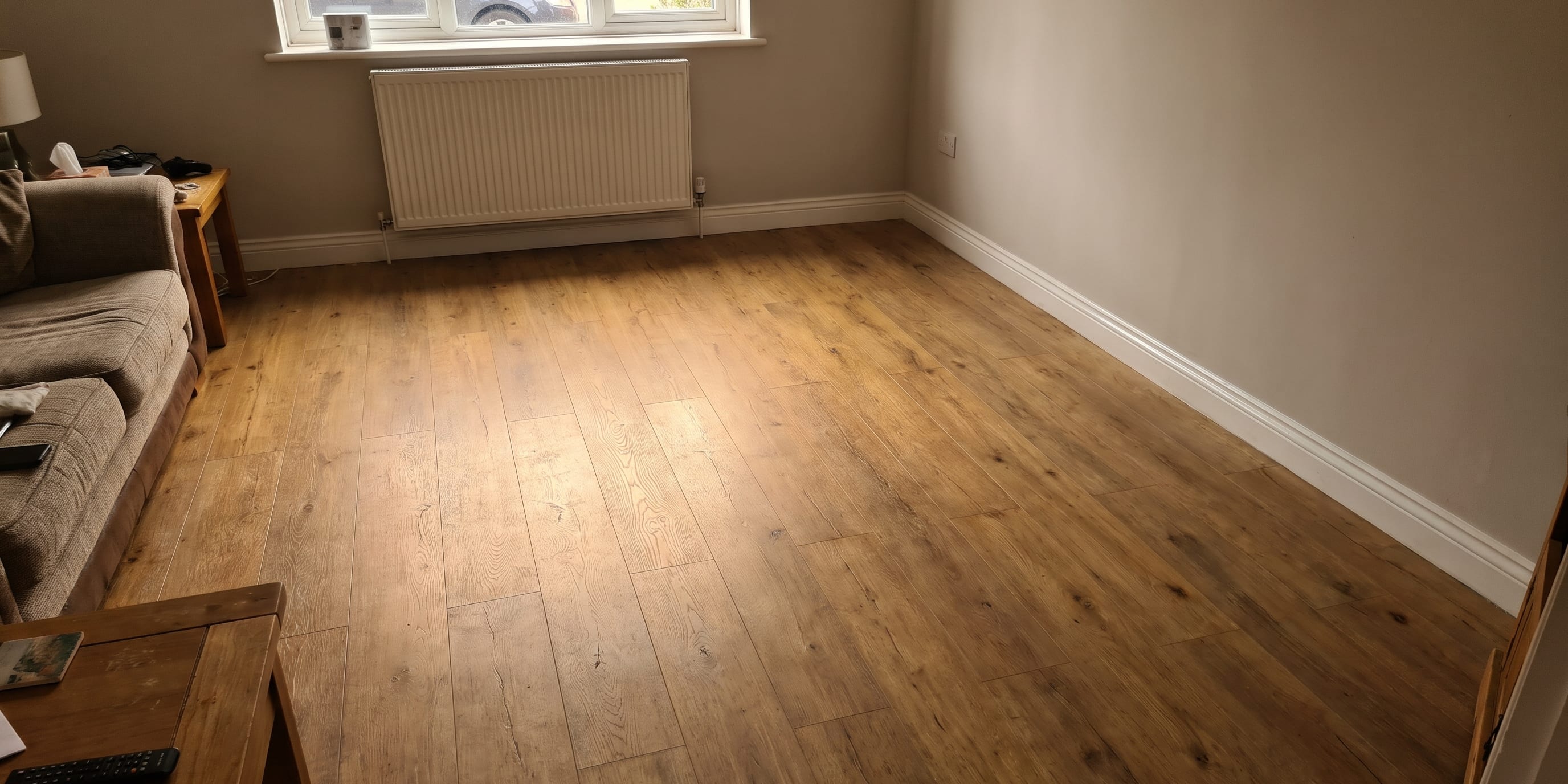
It is a fair question, and the honest answer is that some vinyl does look cheap. Most of us have walked into a room and known within a second that the floor was not real wood. Something about it was too shiny, too flat, too repetitive.
But plenty of vinyl does not look cheap at all. The gap between the two is not random and it is not really about price alone. It comes down to a short list of specific, identifiable things: how the design was printed, how the surface was textured, how thick the protective layer is, what format the material comes in, and how carefully it was fitted. Once you know what those things are, you can spot the difference in a showroom in about thirty seconds.
This guide walks through each one, so you can buy with confidence rather than crossing your fingers.
The giveaways that make vinyl look fake
Before looking at what makes vinyl convincing, it helps to name the things that give the game away. There are four, and they turn up again and again.
Too much sheen. This is the biggest one. Real timber in a domestic setting is rarely glossy. It has a low, uneven lustre that changes as you move around the room. Cheap vinyl often has a uniform high gloss across the whole surface, which reads as plastic to the eye instantly. Worse, that gloss bounces light in a way that flattens the printed grain, so you lose the depth the design was trying to create.
An obvious repeating pattern. Every printed floor has a finite number of unique designs in its repeat. Budget products might use only a handful of different plank faces, so once the floor is down you start noticing the same knot in the same place three boards away. The eye is remarkably good at catching this, even when you are not consciously looking for it.
Visible, obtrusive seams. Joints in sheet vinyl, or badly aligned joints between LVT planks, pull attention straight to the fact that the floor is made of a material being asked to pretend. Seams are not always avoidable, but where they fall and how they are finished makes an enormous difference.
Flat texture. If you run your hand across a convincing vinyl floor, you feel the grain. If you run your hand across a poor one, you feel smooth plastic while looking at a photograph of wood. That mismatch between what you see and what you feel is what the brain registers as wrong.
Wear layer thickness and print resolution
Two technical factors sit behind most of the visual difference.
The wear layer is the clear protective coating over the printed design. It does not create the look, but it preserves it. Wear layers are usually quoted in microns or millimetres, and thicker ones resist scuffing, scratching and the general dulling that comes from grit being walked across a floor for years. This matters for appearance because a scuffed wear layer scatters light. The print underneath has not changed, but it starts to look hazy and washed out, and that haziness is exactly what people describe when they say a vinyl floor "went cheap looking after a couple of years."
A thin wear layer in a hallway or kitchen will show its age quickly. In a low traffic bedroom it may be perfectly adequate. Matching the wear layer to the room is one of the most practical decisions in the whole process.
Print resolution and embossing do the heavy lifting on realism. Better products are photographed from genuine timber or stone at high resolution, which means fine grain, subtle colour variation within a single plank, and the small imperfections that real material has. Then there is the texture. The term to listen for is embossed in register, which means the physical texture in the surface lines up with the printed image. Where you see a knot, you feel a knot. Where you see an open pore, there is a dip. This is the single most convincing feature a vinyl floor can have, and it is the thing cheap products skip because it costs more to tool.
Sheet vinyl and LVT: what actually differs
These two get lumped together but they look quite different in a room.
Sheet vinyl comes on a roll and is laid as a continuous surface, cut and fitted to the shape of the room. Its great strength is that in a small or standard width room you may get the whole floor down with no seams at all, which is genuinely useful in bathrooms and utility rooms where water is a concern. Modern cushioned sheet vinyls have come a long way in print quality and texture. The limitation is that a continuous sheet has no real edges between the printed planks, so the illusion depends entirely on the printed shadow lines. In bright light, that can read as flat.
LVT, or luxury vinyl tile, comes as individual planks or tiles. Because each piece is a separate object, you get genuine edges, usually bevelled, and you get the small variation in level and shadow that real boards have. LVT also tends to carry deeper embossing and a wider range of designs in the repeat. It is the format to choose if the priority is convincing realism.
Neither is automatically the right answer. A busy family bathroom might be better served by a seamless sheet. A kitchen diner where the floor is the main visual element is usually better in LVT.
How installation changes the look
This is the part the product pages never mention, and it is at least as important as what you buy.
Plank width and length change the character of a room entirely. Narrow planks read as traditional and busy. Wider, longer planks read as contemporary and calm, and crucially they reduce the number of joint lines, which means fewer opportunities for the repeat to become obvious.
Laying pattern matters too. A herringbone or chevron layout immediately signals deliberate craftsmanship, because nobody lays a cheap floor in herringbone. Even in a straight lay, staggering the joints properly and avoiding a stepped pattern across the room makes a real difference. So does sorting planks before fitting, mixing from several packs so that near identical designs do not end up next to each other.
Bevelled edges create a shadow line at every joint. On a well laid floor this mimics the gap between real boards and adds depth. On a poorly laid floor over an uneven subfloor, those same bevels exaggerate every ripple.
Which brings us to subfloor preparation, the least glamorous and most consequential part of the job. Vinyl is a thin, flexible material. It will follow whatever is underneath it. Lumps, screw heads, dips and old adhesive ridges all telegraph through to the surface, and once light rakes across the floor from a window, you see all of them. Levelling, filling and priming is what separates a floor that looks laid from a floor that looks poured in place.
Then there are the edges. Clean scribing around door frames, neat cuts at pipework, properly fitted thresholds and trims. These details are what the eye reads as quality, often without consciously registering them.
What to check on a sample before you buy
Take a sample home. Never decide in the showroom alone.
- Look at it in daylight and at night. Showroom lighting is designed to flatter. Your kitchen downlights are not. Low angle light in particular will reveal sheen and texture honestly.
- Check the sheen level. Matt and low sheen finishes almost always look more convincing than gloss. Tilt the sample towards a window and see how much it bounces.
- Feel the texture with your eyes shut. Does the grain you can see match what your fingers find?
- Ask how many designs are in the repeat. A supplier should be able to tell you. More unique plank faces means less visible repetition.
- Ask about the wear layer and say honestly where the floor is going. A hallway is not a spare bedroom.
- Check the edge detail. Bevelled, micro bevelled or square, and how neatly finished.
- Put the sample next to your skirting, doors and worktop. Undertone clashes are hard to see in isolation and impossible to ignore once the floor is down.
The honest summary
Vinyl looks cheap when it is a glossy, flat, thinly protected print laid over an unprepared subfloor. It looks genuinely convincing when a well made product with good texture and a sensible wear layer is measured properly, laid thoughtfully and finished with care. The material is capable of either outcome. Which one you get is a series of decisions, most of which are made before anyone touches a floor.
If you would like to see and handle samples in your own light, and talk through which format and finish suits the rooms you have in mind, you can find out more about Boundary’s vinyl flooring service and arrange a measure at your convenience.
Questions
Frequently Asked Questions
Can vinyl flooring really look like real wood?
Good quality vinyl can be very convincing, particularly when the surface texture is registered to the printed grain so you feel the knots and pores you can see. The giveaways are usually high gloss, an obvious repeating pattern and poorly finished edges rather than the print itself.
Is LVT better looking than sheet vinyl?
Usually, yes. LVT comes in individual planks or tiles with bevelled edges and deeper embossing, which breaks up the surface the way real boards do. Sheet vinyl is a continuous roll, so it relies entirely on the print and can look flatter, though modern sheet products are far better than their reputation.
Does a thicker wear layer make vinyl look more realistic?
Not directly, but it protects the realism. The wear layer sits over the printed design, so once it scuffs and dulls, the print underneath starts to look washed out. A thicker wear layer keeps the floor looking the way it did on day one for longer.
Why do the seams in my vinyl floor show?
Visible seams usually come down to subfloor preparation, joint placement or the way the material was cut and welded. A floor laid over an uneven subfloor will telegraph every dip and ridge, and seams put in an obvious sightline will always draw the eye.
What should I check on a vinyl sample before I buy?
Look at it in daylight and under your own lighting, check the sheen level, run your hand over the texture, and ask how many different plank designs are in the pattern repeat. Also ask what the wear layer is and whether the edges are bevelled.